Votre designer bilingue prêt à mettre en lumière votre entreprise


The Hidden Art of French Road Signs: A Graphic Designer's Perspective
Dive into the fascinating world of French road signs with my latest blog post, ‘The Hidden Art of French Road Signs: A Graphic Designer's Perspective.’ As a passionate graphic designer, I explore how design subtly influences our daily lives and enhances our safety on the road. Discover the regional variations that reflect local culture and the carefully crafted elements that ensure legibility at high speed. This post reveals the complex mix of history, psychology and art behind road signs. Join me on this journey to appreciate the invisible but essential work of the graphic designers who make our road navigation fluid and intuitive.
Catherine Rompais
3/4/20254 min read
As a graphic designer, I’ve always been fascinated by the subtle ways design influences our everyday lives—often without us even realising it. One of the best examples of this is road signage. While driving through France, you might think that road signs are purely functional, directing you from one place to another. But take a closer look, and you’ll see a remarkable variety in regional signage, reflecting a complex interplay of history, culture, and visual communication. What seem like simple symbols on a metal plate are, in reality, the work of highly skilled designers who understand legibility, psychology, and efficiency—key principles that govern how we absorb information at high speeds.
Regional Differences in French Road Signage
If you’ve ever taken a long road trip across France, you may have noticed that road signs subtly vary from one region to another. It’s not just your imagination. While national road signs follow standard conventions set by French traffic laws, their implementation differs depending on the region.
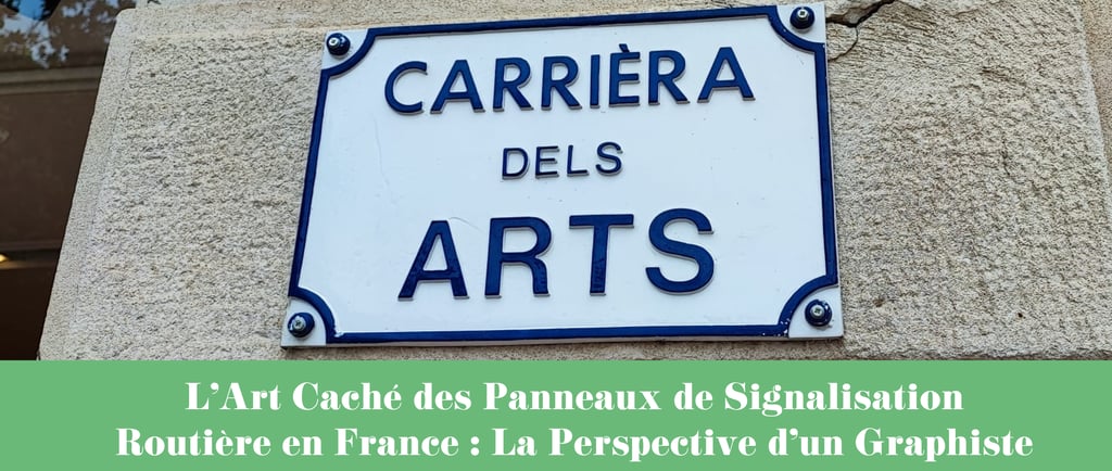
In Brittany, for example, you’ll often find bilingual signs, with Breton names appearing alongside French ones. This reflects the region’s commitment to preserving its Celtic heritage. In Alsace, where the German influence is strong, signs may include place names that more closely resemble their German counterparts. Parisian signage tends to be ultra-functional and minimalist, matching the city’s fast-paced nature, while in rural Provence, signs often appear more traditional, sometimes with ornate lettering and stylised arrows reminiscent of older designs.
In northern France, particularly in French Flanders and Lille, road signs sometimes include Flemish (Dutch) place names alongside the French ones—a nod to the region’s historical and linguistic ties with Belgium and the Netherlands. This bilingual approach, like in Brittany and Alsace, reflects a desire to maintain local heritage while still respecting national traffic laws.
These variations may seem minor, but they demonstrate how graphic design adapts to cultural identity—proving that even something as universal as a road sign can have a local flavour.
The Invisible Hand of Graphic Design in Signage
Graphic design is an art that, when done well, becomes invisible. We take for granted that we can read road signs easily, that they guide us effortlessly, and that they make sense even when we’re driving 130 km/h on a highway. But this isn’t a coincidence—it’s the result of years of study, testing, and refinement. The shape, typeface, colour, and spacing of road signs are all carefully crafted to ensure clarity and quick readability.
For example, have you ever noticed that French highway signs use white text on a blue background? It’s not just an aesthetic choice. Blue is a calming color that contrasts well with white, making it highly legible from a distance. Similarly, green signage is used for national roads, while white signs with black lettering are for local destinations. Every element is designed with purpose, and when it works well, we don’t even notice the effort behind it.
Pioneers of Modern Highway Signage Design
The world of road signage owes much to three key figures who revolutionised the way we navigate roads:
1. Jock Kinneir & Margaret Calvert (British Influence on France)
British designers Jock Kinneir and Margaret Calvert developed the modern Transport typeface used in the UK, which influenced many European signage systems, including aspects of the French one. Their work set new standards in legibility and usability, inspiring future signage projects around the world.
2. Jacques Bertin (France)
French cartographer and designer Jacques Bertin was a major figure in the study of visual communication. His work in information design laid the foundation for clearer and more effective signage throughout France, ensuring symbols and layouts were standardised to minimise confusion.
3. Paul Mijksenaar (Netherlands, with Global Influence)
Dutch designer Paul Mijksenaar is best known for his airport signage, but his principles of clarity and intuitive navigation strongly influenced highway signage as well. His philosophy emphasises instant recognition—crucial when drivers have only seconds to process information.
These designers understood three crucial elements that make signage effective:
Legibility: Typeface, spacing, and contrast must be optimised for high-speed readability.
Standardisation: Consistent symbols and formats reduce confusion and build familiarity, helping drivers react quickly.
Wayfinding Psychology: The brain processes colour, shape, and directional cues faster than text, so well-designed signs prioritise those elements.
Why We Shouldn't Take Graphic Design for Granted
As drivers, cyclists, or pedestrians, we rely on signage every day, yet few people take the time to appreciate the incredible work that goes into its design. The best design is often invisible—not because we can’t see it, but because it works so well we don’t have to think about it. A poorly designed road sign, however, can be dangerous, leading to confusion and even accidents.
Graphic design goes far beyond logos and advertisements—it shapes our daily interactions with the world, making everything from road signs to user interfaces intuitive and effective. The next time you’re driving and easily spot an exit sign or navigate a complex interchange without a second thought, take a moment to appreciate the ingenious, invisible art of graphic design.
Conclusion: The Quiet Power of Design
Road signage is a perfect example of how graphic design shapes our experiences in invisible yet fundamental ways. Whether through regional nuances in French signage, the work of brilliant designers who perfected highway navigation, or the psychology behind colour and typography choices, every aspect is carefully crafted to make our lives easier.
So next time you’re on the road, take a moment to notice the signage around you. Appreciate its clarity, its effectiveness, and its elegance. And remember—great design isn’t just about looking good; it’s about making life smooth, safe, and smart.
Catherine
© 2026. All rights reserved.
Copyright and intellectual property
All content, illustrations, designs and graphic creations on this site are the exclusive property of Ray of Sun Lille and Catherine Rompais, unless otherwise stated. Any reproduction, modification, distribution or use without prior written authorisation is strictly prohibited, in accordance with articles L.111-1 et seq. of the French Intellectual Property Code. Any violation of these rights may result in legal action. For all requests for use or licences, please contact me at catherine@rayofsun.fr.